

AMEX MOCA
Redesign and development process for desktop-based application
the PROBLEM
Our internal business partners lacked an effective tool for managing and optimizing their AMEX advertising budgets.
our SOLUTION
We redesigned a budgeting tool that uses algorithmic models to project budgets, compare scenarios, and optimize allocations when needed.
my role
I served as the Lead UX Designer, responsible for the experience strategy and design of the responsive web application.
WHAT WE LEARNED THROUGH RESEARCH
Through our research, we discovered that users wanted to compare different budget scenarios and use data visualisations to understand the differences between them. For a deeper understanding of their allocations, users wanted the ability to adjust each channel and the products within those channels.
The Application CONCEPT has a 3-Step process
1 ONBOARDING WALK-THROUGH WIZARD
The Walk-Through Wizard guides users through the budget planning process by helping them enter the parameters required for budget projections. Users can import data, define date ranges, and adjust allocations by channel and product to create a customized planning framework.
2 SCENARIO BUILDER
Users can create, save, and compare multiple budget scenarios. They can also optimize selected budgets using business intelligence and predictive algorithms that leverage large-scale data to recommend the most effective allocation of funds across channels and products.
3 DATA VISUALIZER
Interactive data visualizations help users understand how each budget plan is structured and how it compares with alternative scenarios. These insights allow users to quickly identify allocation differences, evaluate performance projections, and make more informed budgeting decisions.
User Journeys were mapped out
First round of wires to be tested
WHAT WE LEARNED FROM TESTING
Through testing with our users, we learned that they wanted to import one budget and keep it as a template to build a second budget. Therefore, we built functionality to allow a user to base a new budget off an existing imported budget by duplicating it.
WHAT WE LEARNED FROM TESTING
Users needed a much more concise but efficient Walk-Through Wizard to start the process. Through our discussion, we learned that because they only use the application once every 6-12 months, many users needed more structured guidance and hand holding.
Walkthrough setup wizard


A Budget has to be RUN to be visualized
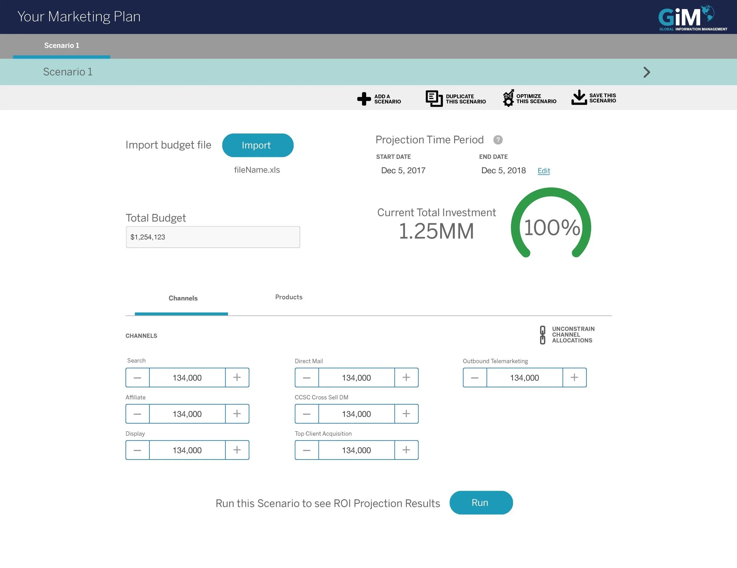
Users can modulate a CHANNEL of advertising as well as PRODUCT
If a user disproportionately modulates allocations, a meter warning lets them know how much they've over budgeted

By understanding the application's usage contexts, we developed a clear vision for the user experience and established a set of guiding experience principles. These principles informed design decisions, reinforced the product's core values, and defined the qualities the experience should embody. They provided a consistent foundation for the application's visual language, interaction model, and overall design direction.
WHAT WE LEARNED FROM TESTING
Users wanted granular control over budget allocations, enabling them to fine-tune investments at the product level and assess the impact of each decision. Data visualisations allowed them to compare scenarios and identify performance differences, while optimisation tools provided data-driven recommendations to help them select the most effective budget strategy.
My contributions included:
DISCOVERY & RESEARCH
Product Strategy
User Persona Definition
UI/UX Assessment
Focus Groups
Content Audit
Taxonomy
Experience Maps
IDEATION
Design Workshops
Card Sorting
User Stories & Scenarios
Customer Journey Mapping
Usability Audit
Storyboarding
Rapid Prototyping
Information Architecture
Site Maps
Low Fidelity Wireframes
REFINEMENT
High Fidelity Wireframes
UI Visual Design
Clickable Interactive Prototypes
Pixel Perfect Comps
Design Assets
Visual Design Style Guide
Interaction Library Development
Technical Specifications